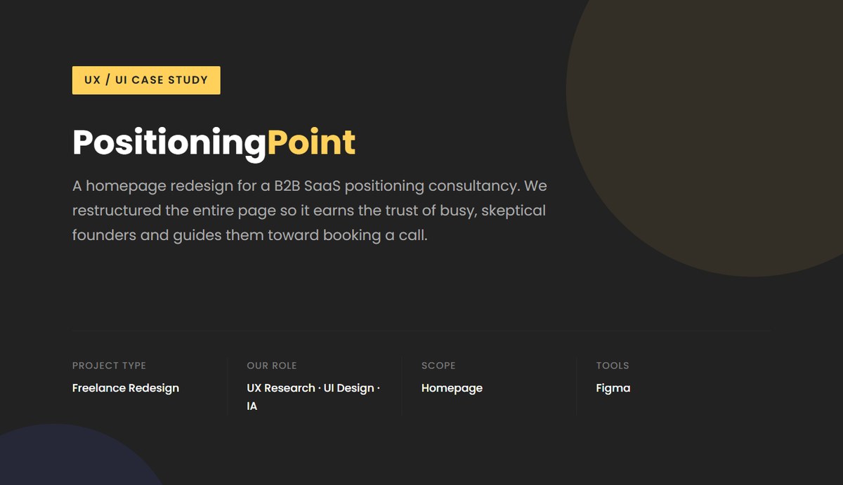
PositioningPoint: B2B SaaS Homepage Redesign
Overview
PositioningPoint is the consulting practice of Silky Agarwal, a B2B SaaS positioning and messaging specialist with 12+ years of experience who has advised challenger SaaS companies including Freshworks, Precoro, RippleHire, and NextBillion. The service was sharp and genuinely different. The homepage failed to show it. The right content already existed, but it sat in the wrong order, with the wrong emphasis, and without enough specificity.
Client’s business goal
Turn a homepage that explained a methodology into one that converts founder-CEOs of pre-scale B2B SaaS companies into booked intro calls.
Problem statement
How might we restructure the page so a skeptical, time-pressed founder recognises their own problem, trusts the proof, understands the engagement, and knows exactly what to do next?
Challenges
Process
Audit
Heuristic evaluation of the original homepage
Before changing any visuals, we audited the existing homepage against the Nielsen Norman Group's 10 usability heuristics. Six clear violations explained why strong content was failing to convert.
- Match between system & real world: the headline spoke in positioning theory, not founder language
- Recognition rather than recall: framework diagrams appeared before the problem was explained
- Aesthetic & minimalist design: every section demanded equal attention, so nothing stood out
- Visibility of system status: no view of what happens after the intro call
- Consistency & standards: proof appeared in no deliberate order
- Flexibility & efficiency: a single footer CTA forced everyone through the full scroll
Define
Four design goals
Set the bar for what the redesigned page had to do before a single section was drawn.
- Make the value instantly clear: who it's for and what they gain, within five seconds
- Build a narrative funnel: pain, then solution, then proof, then process, then action
- Surface specificity: name the exact audience, problem, and outcome
- Earn trust progressively, so proof backs each claim as it is made
Restructure
Rebuilding the page flow
The most impactful decision was not visual, it was structural. We rethought the entire content sequence to mirror how a skeptical founder actually evaluates a service provider: methodology visuals and framework diagrams now come after testimonials and proof, not before.
- Rewrote the hero around the outcome, in the founder's own vocabulary
- Added a pain-framing section so visitors recognise the problem before the pitch
- Layered proof: client logos, then a stats bar, then video testimonials, then named engagements
- Moved the framework visuals late, once the method had earned the right to be explained
- Added a “three phases in our engagement” section for process transparency
Design
Key UI decisions
A disciplined visual system that supports scanning and reserves emphasis for the moments that matter.
- Typography hierarchy: clear contrast in size and weight gives every section an entry point
- Color discipline: the yellow accent marks CTAs, key callouts, and section markers only
- Section rhythm: alternating light and dark backgrounds signal a change of topic
- Contextual CTAs placed right after the most convincing sections, not just the footer
- Scenario mapping so founders can find their exact situation on the page
Artifacts
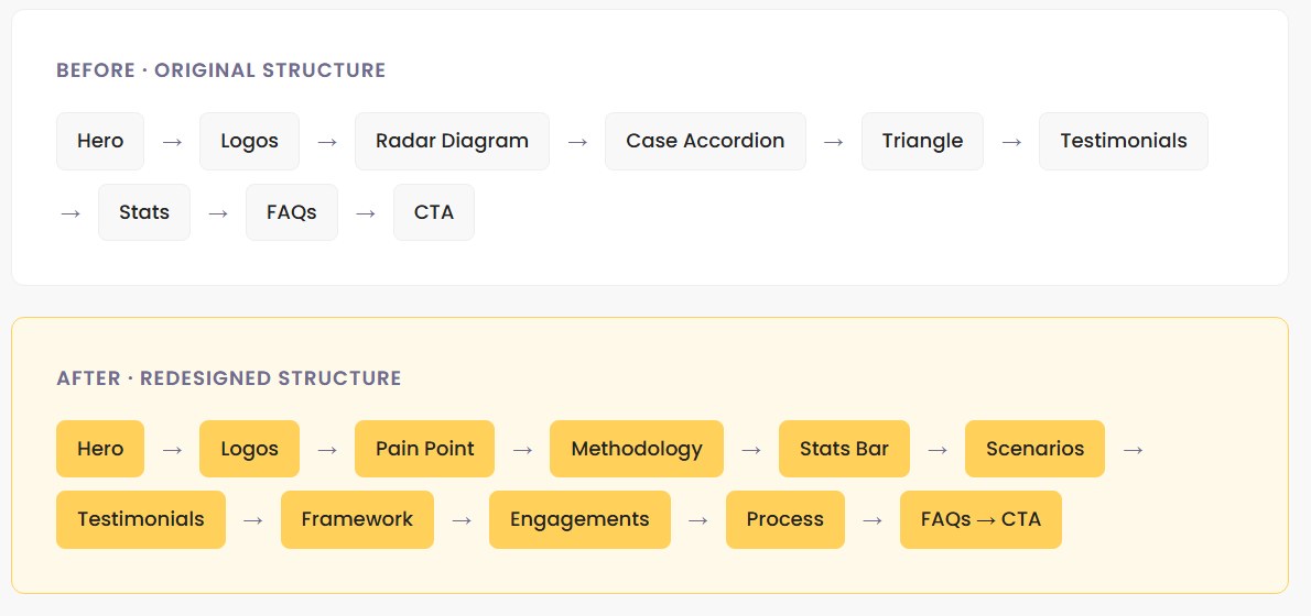
The structural change: original page order versus the redesigned narrative sequence.
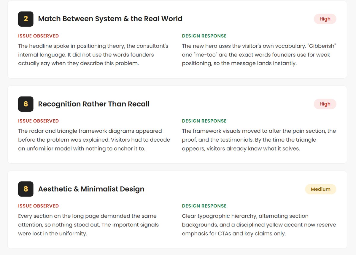
Heuristic audit extract: each violation paired with the design response that answers it.
Typography
Poppins
Headings & body copy
Colors
Brand Yellow
#FFD15B
Ink
#222222
Accent Indigo
#4D61FC
Light Surface
#EEEEEE
Outcome
The core challenge was never aesthetic. The original site had strong content. The real problem was that the content was not structured to convert. The redesign meant understanding how a skeptical, analytical SaaS founder evaluates a consultant, and building the page to match that exact mental sequence.