Boys & Girls Clubs of Silicon Valley: Nonprofit Platform Redesign
Overview
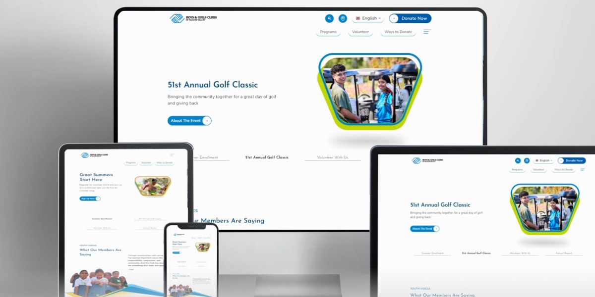
A redesign aimed at lifting engagement through streamlined navigation, refined graphics, and stronger page design, all built on the Boys & Girls Clubs brand palette. The site had to serve three audiences arriving with completely different intent: donors, parents, and volunteers.
Client’s business goal
Highlight BGCSV's vision, mission, core beliefs, and community impact to raise awareness of what the organisation offers, deepening engagement with existing community members while expanding the member base.
Problem statement
How might we strengthen the website's structure, improve navigation, and refine the information architecture to create an intuitive experience, one that boosts lead generation and grows BGCSV's community?
Challenges
Process
Discover
Assessment & competitive analysis
Examined the existing navigation structure, the requirements of the site and its programs, and studied peer and competitor organisations to find patterns worth borrowing.
- Analysed the current site alongside competitor and peer nonprofit sites
- Outlined specific requirements tailored to the BGCSV audience
- Captured the client's expectations for site functionality
- Set project goals: user journey, readability and accessibility, SEO
Define
Navigation architecture & user flows
Turned the findings into a navigation architecture and look-and-feel direction built on the existing brand colors, then mapped user flows per audience to drive the menu structure.
- Conducted stakeholder interviews
- Redesigned the information architecture across eight top-level sections
- Identified primary users and created user flow diagrams
- Defined the top navigation menu structure
Design
A youthful, brand-true visual system
Developed a unified visual framework: low-fidelity options to settle the typeface, brand colors carried through into graphics, and the Silicon Valley sense of place worked into the illustration style.
- Designed low- to high-fidelity pages across the site
- Chose clean, simple typefaces for headings and long-form copy
- Applied the established brand color system to shapes and cards
- Replaced dense text blocks with infographics for key content
- Trimmed the crowded top nav to priority items, with the rest in a hamburger
Deliver
Responsive build & launch
Developed the site, made it responsive across screen sizes, and ran rigorous QA/QC across devices before launch.
- Verified smooth functionality across devices through QA/QC
- Launched a site matching the client's “youthful and sophisticated” brief
Artifacts
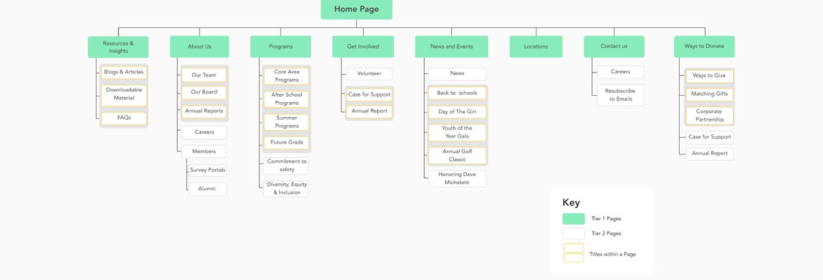
Redesigned information architecture: eight top-level sections mapped down to individual page titles.
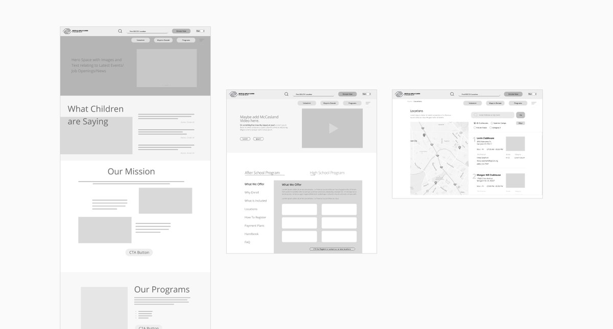
Wireframes for the homepage, program detail, and club locator pages.
Typography
Josefin Sans
Title headings
Nunito Sans Caps
Short titles
Nunito Sans Light
Paragraph copy
Colors
Primary Blue
#0081C6
Deep Navy
#004B87
Accent Orange
#FF8200
Accent Purple
#492F92
Accent Lime
#C2D500
Sky Tint
#BDDEF5
Outcome
The delivered site embodies the “youthful and sophisticated” aesthetic the client asked for, with an architecture that gives donors, parents, and volunteers each a clear path from landing to action.