Cyber Defense Group: Enterprise UX Redesign
Overview
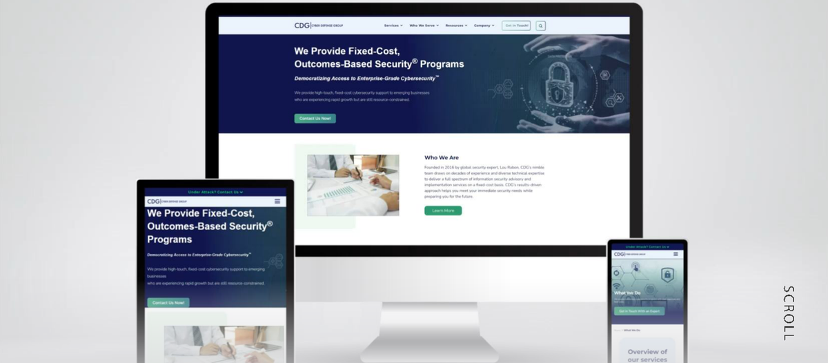
CDG is a focused cybersecurity consultancy that partners with clients to deliver a holistic approach to risk and threat management, providing education, maintenance, and support for data protection. The brief was to optimize their website to increase customer engagement and offer a seamless user experience.
Client’s business goal
Provide end-to-end security expertise through the world's best security technology, combined with trusted consulting experience and service excellence.
Problem statement
How might we strengthen the structure and improve the navigation and information architecture of the website so users have an intuitive experience, one that generates leads and increases CDG's customer base?
Challenges
Process
Discover
UX audit & competitor analysis
Ran a full audit of the existing site using heuristic principles and a competitive analysis against other security consultancies (Praetorian, Chariot, Laminar) to find opportunity areas.
- Conducted a UX audit and competitor analysis
- Gathered insights and requirements for the new site
- Focused on meeting user expectations for a seamless experience
- Mapped CDG's own expectations for website functionality
Define
Information architecture & brand color system
Converted the audit findings into a coherent site structure: restructuring navigation, defining a sitemap by service category, and refining the color system so it could carry visual hierarchy, not just brand identity.
- Conducted stakeholder interviews on service offerings and structure
- Redesigned the top-level navigation and full sitemap
- Refined the color palette to add visual hierarchy
Design
Wireframes, typography & functional patterns
Built low- to high-fidelity wireframes for every core page, paired Montserrat headlines with Nunito body copy, and designed the functional patterns the old site was missing: breadcrumbs, CTA placement, infographics.
- Designed low- to high-fidelity pages for the full site
- Restructured the menu into clear, relatable categories
- Added breadcrumb navigation for orientation on deep pages
- Placed assertive, specific CTAs at the point of decision
- Replaced dense text blocks with infographics for key content
Deliver
Launch
Shipped a responsive, user-centric site across desktop, tablet, and mobile after a round of QA across devices.
- Launched the CDG website as a significant milestone in the engagement
- Verified responsive behaviour across devices before handoff
Artifacts
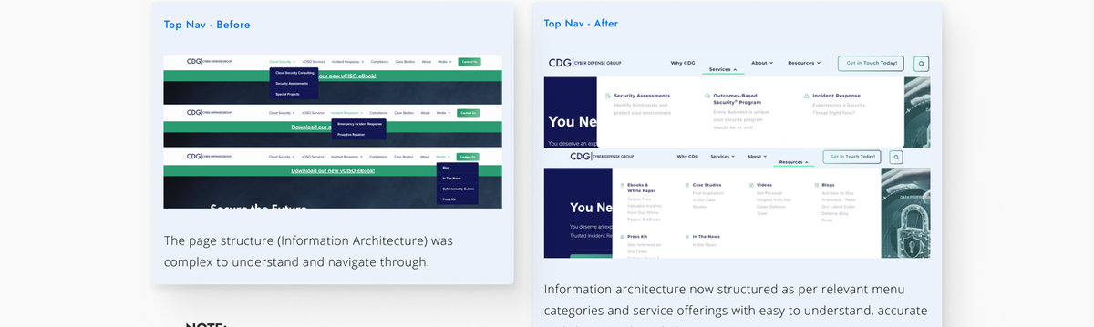
Top navigation before and after: from an unlabeled dropdown-heavy menu to clear, categorized service groups.
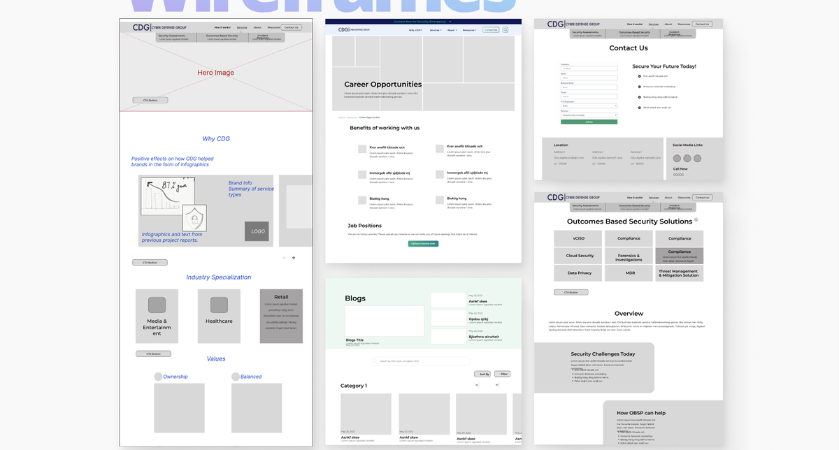
Low-fidelity wireframes covering the homepage, careers, blog, and service detail pages.
Typography
Montserrat
Headlines
Nunito
Paragraph copy
Colors
Royal Blue Dark
#131751
Light Green
#00EC72
Alice Blue
#E9F2FD
Mint S Ruby
#EEF8F2
Results
1.9–2.2%
Conversion rate increase in the first 6 months
40–45%
Increase in engagement rate
$3M+
Business opportunity through generated leads
40%
Increase in website traffic within 6 months
12–15
Quality leads generated per month